The Seventh-day Adventist symbol, which many people think of as the “logo,” has been in use since 1997, and is the most recognizable element of our existing visual identity system. Though it may not communicate everything, because of its consistent use it now carries a deep significance for all who are familiar with it. The symbol, like all symbols, functions much more as a container for attributed meaning than as a theological statement. It is we, Seventh-day Adventist members, who give that symbol meaning. Because of the meaning it already holds, establishing over 20 years of brand equity, the shapes of the symbol remain largely unchanged from the original. The symbol is a registered trademark of the Seventh-day Adventist church, and use of the symbol is important in instances when communicating an official association with the Seventh-day Adventist church. The registered trademark may be used by the Seventh-day Adventist Church, its entities, institutions (including churches and schools) as authorized by the General Conference of Seventh-day Adventists, its divisions, unions and conferences.
Aside from ensuring that the symbol continues to appear on materials, the new system affords a wide level of flexibility. The symbol is now free to exist in isolation, detached from the name of the church or entity. It is still preferable for the symbol to have a thoughtful relationship to the rest of the design system. We recommend in most cases, where the symbol is detached, it sit within in the Sabbath column. When not using the Adventist symbol within the Sabbath column or locked up with an entity name, the preferred version is the knocked-out circular version, which allows for more graphically pleasing layouts.
Additionally, the symbol is now allowed to exist in a variety of colors. Moving forward, it is recommended the symbol only be used in solid-color versions. The symbol may be a different color than the accompanying wordmarks, but all elements of the symbol should appear in the same color.
Beyond deciding which version of the symbol to use, and which color to use it in, it is requested that you make no creative modifications to the symbol. It is important that our most globally recognized element continues to be easily recognized. To help our audience, it is requested that you do not modify or integrate the logo, or any parts of it, either in isolation or as part of any other entity logo, unless given express permission by the General Conference. Though this is primarily about visual strategy, there are some legal restrictions governing registered trademarks, and more information about that can be found on our legal page.
Symbol in Lockup
Symbol in Sabbath Column
Symbol in Isolation
The Meaning of the Logo
The logo reflects the core values of the Seventh-day Adventist Church. Its foundation is the Bible, the Word of God, shown open because its message should be read and put into practice. Central to that biblical message is the cross, which is also a central feature of the logo. Above the cross and the open Bible is a burning flame that represents the Holy Spirit, the messenger of truth.
The Second Coming
The lines at the top of the design suggest upward momentum symbolizing the resurrection and ascension to heaven at Christ’s second coming, the ultimate focus of our faith.
The Flame
This is the shape formed by three lines encircling an implied sphere. The lines represent the three angels of Revelation 14 circling the globe and our commission to take the gospel to the entire world. The overall shape forms a flame symbolic of the Holy Spirit.
The Cross
The symbol of the cross, representing the gospel of salvation, is positioned in the center of the design to emphasize Christ’s sacrifice, which is the central theme of the Adventist faith.
The Open Bible
The Bible forms the base of the design and represents the biblical foundation of our beliefs. It is portrayed in a fully open position suggesting a full acceptance of God’s word.
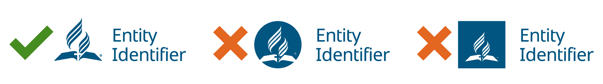
Key
The visual explanations of the guidelines across the site use the above three symbols to note acceptable applications of the system.
The green checkmark (✓) notes acceptable and preferred applications. You can reliably use applications with the green checkmark across many different contexts without needing to worry much about visual coherence.
The yellow exclamation point (!) notes applications that are acceptable but not preferred. When using these applications, you should be very careful to note how other visual elements interact with the specific element.
The red X notes unacceptable applications of the system. While this visual system isn’t something to be enforced, those applications noted with the X could either cause a fragmentation of the identity or simply be poorly designed.