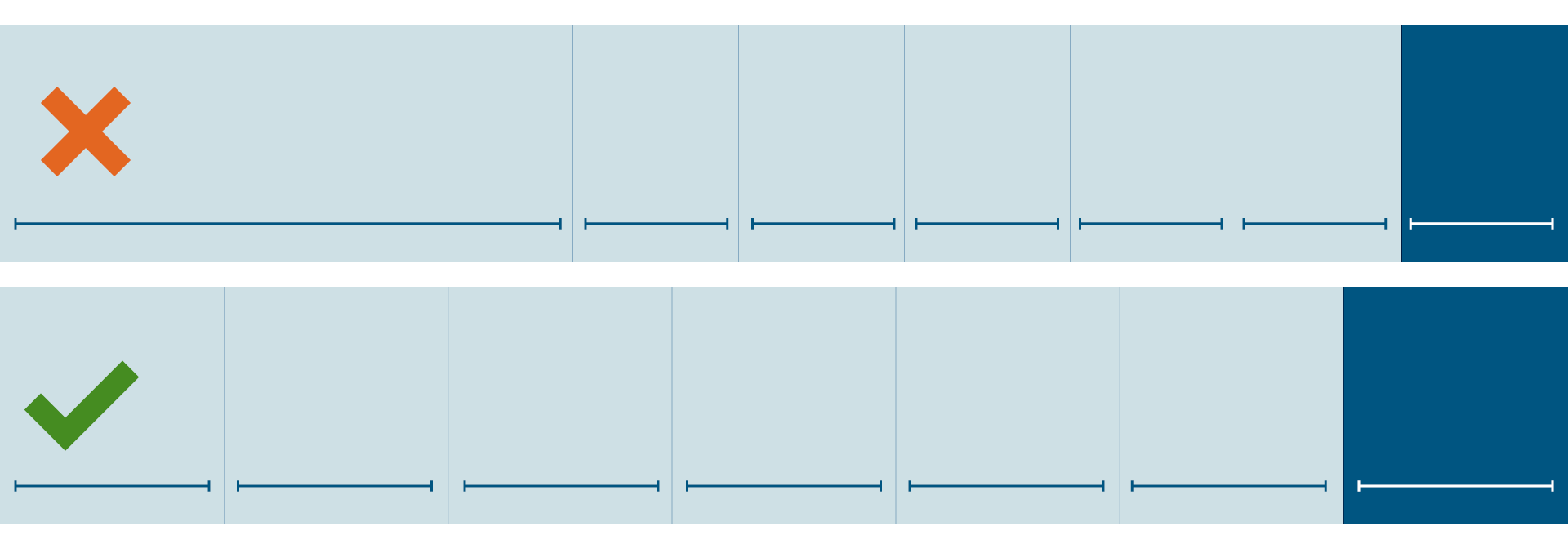
The most important element in the design system is what we are calling the “Creation Grid.” This is a seven-column layout structure to be used in the majority of design situations to communicate our conviction that all time leads to a beautiful end.
The first six columns are yours to fill with text, images, illustrations, patterns, logos or anything else, and in those six columns you should do all your work of communicating information. But the seventh-column, the Sabbath column, is to be set apart—to be special and different from the other six columns, as a reminder and visual celebration of the last day.
We all celebrate the Sabbath in different ways, so how you make the Sabbath column different and special is, to an extent, up to you. The principle to keep in mind is contrast. You can do something complex and colorful in the first six columns, or you can do that with the seventh column, but if you do it on both sides then the seventh-column is no longer different.
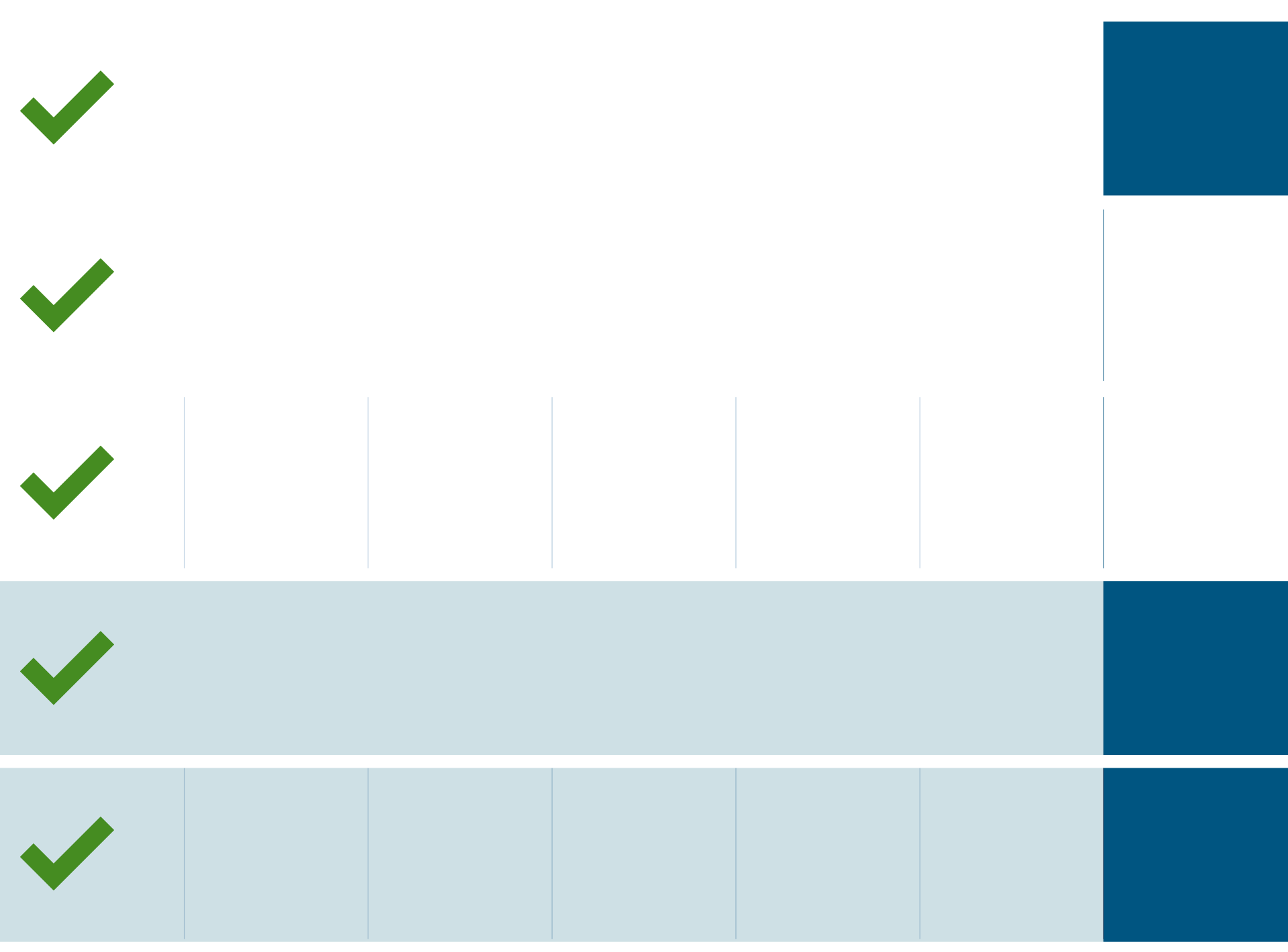
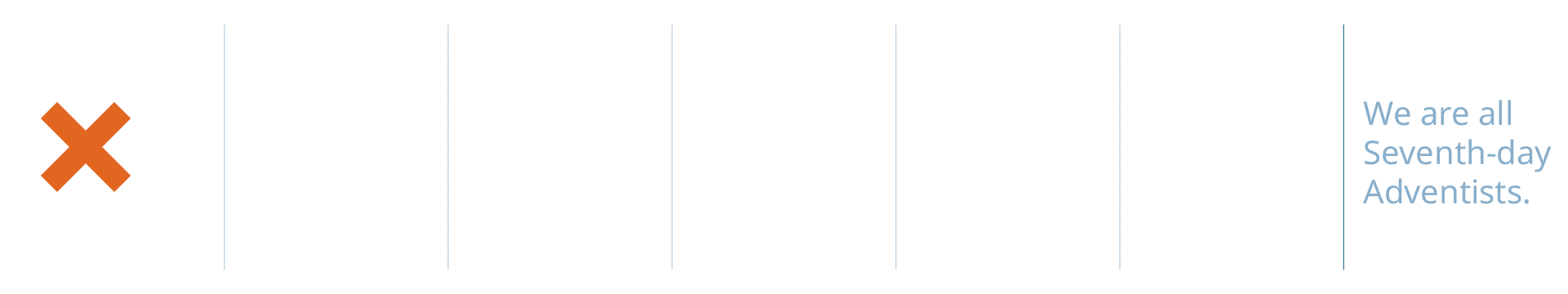
Other than that, the Sabbath column can be filled with just about any background element—a full-bleed image, a texture, pattern, illustration, bold colors, a gradient, or even white space—as long as it is beautiful and fills the entire column. Aside from full-background elements, the seventh-column should never include identifying marks or text of any kind, with the exception of the Adventist Symbol.
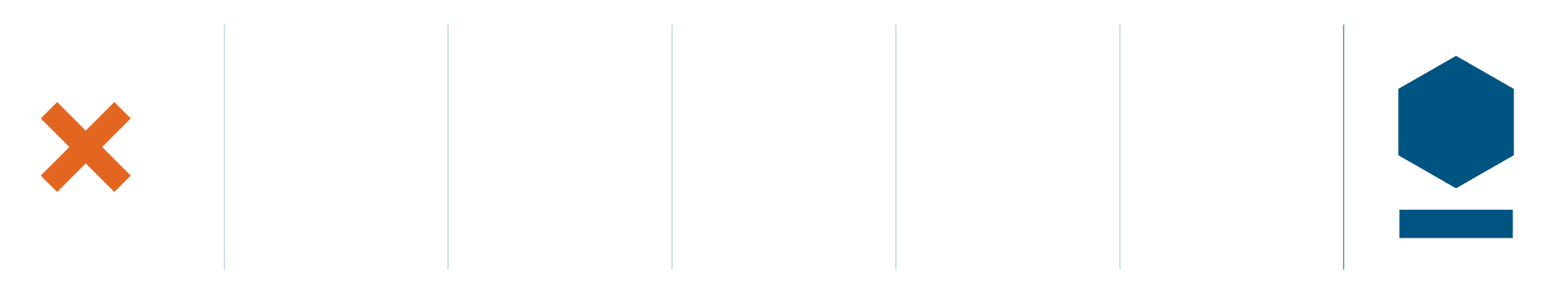
Though the Adventist Symbol can be placed anywhere in a layout, it is the only non-background element that may be placed in the Sabbath column.
There are certainly instances when using the grid might not make sense for your particular context or application. In those instances it is permissible and even encouraged that you ignore the grid and place the symbol/artwork as needed. This would typically apply to applications in which the symbol stands alone or is not intended to be integrated with the surrounding layout.
Key
The visual explanations of the guidelines across the site use the above three symbols to note acceptable applications of the system.
The green checkmark (✓) notes acceptable and preferred applications. You can reliably use applications with the green checkmark across many different contexts without needing to worry much about visual coherence.
The yellow exclamation point (!) notes applications that are acceptable but not preferred. When using these applications, you should be very careful to note how other visual elements interact with the specific element.
The red X notes unacceptable applications of the system. While this visual system isn’t something to be enforced, those applications noted with the X could either cause a fragmentation of the identity or simply be poorly designed.